Fletcher Ward Design Ltd. 020 7637 0940 fwd@fletcherwarddesign.co.uk
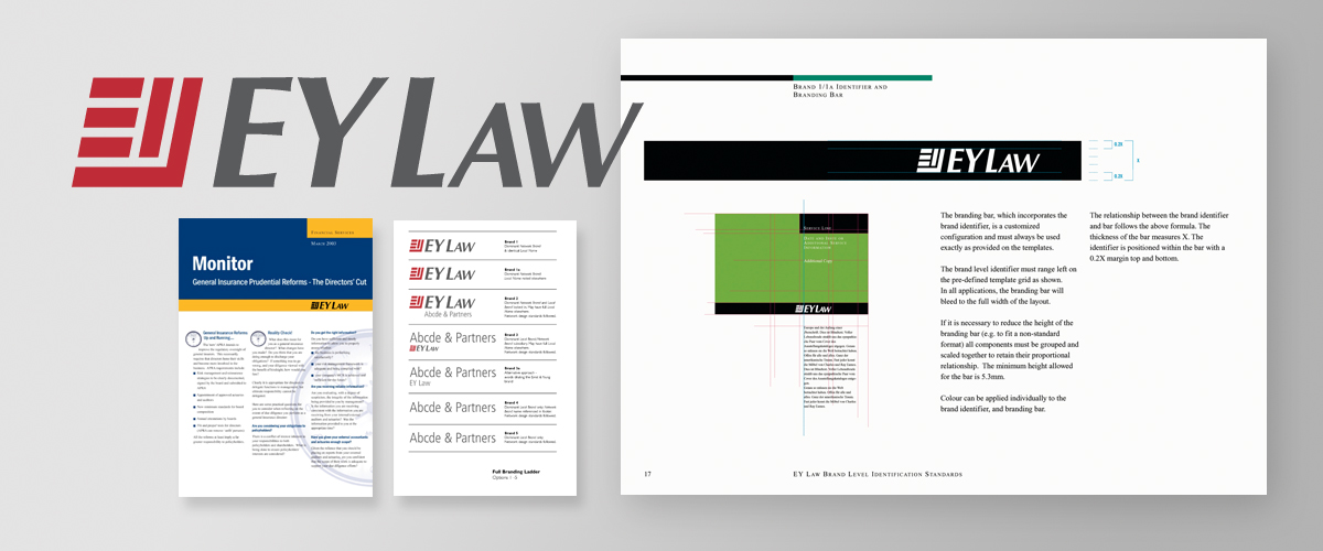


EY Law
A major branding exercise to enable Ernst & Young to combine its law firms around the world under one brand.
A large and highly detailed piece of work for which we won the prestigious LEMAS award for 'Best Design Agency'.
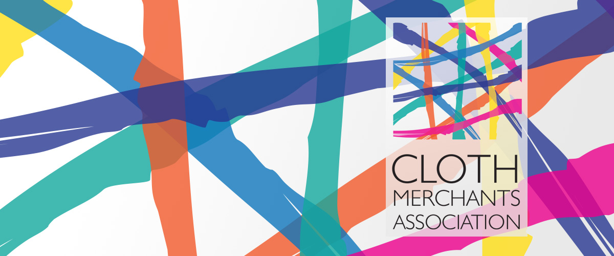
Cloth Merchants Association
As we’ve stated elsewhere, this logo is an important contributory factor in giving the CMA a solid foundation for its brand.
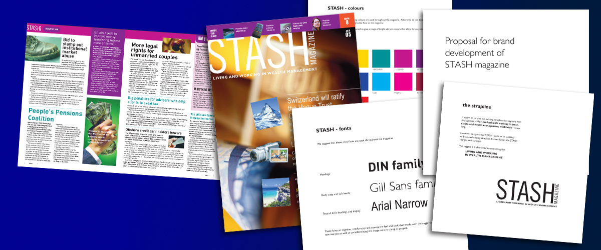
Stash MAGAZINE
The magazine had grown from small beginnings and needed a complete overhaul and re-branding to reflect the financial advice offered to its wealthy readership. The publication has recently changed its name to
HNW (High Net Worth) but has retained the distinctive Stash branding.
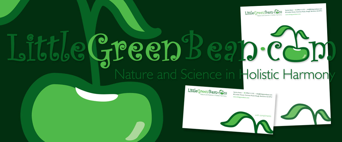
Little Green Bean
We met this lady at an exhibition for start up companies. She impressed us with her determination to bring natural and scientific methods together for a range of health related products - and she has made
it work.
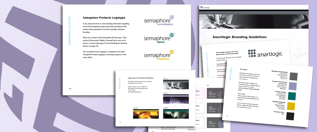
Smartlogic
Semaphore is the name of the software developed by Smartlogic to give clients control of information by the use of classification and the management of metadata. The challenge was to create a new identity that rebranded and established Smartlogic’s position in its markets and included logotype design and brand development that worked across the company’s website and its printed collateral.
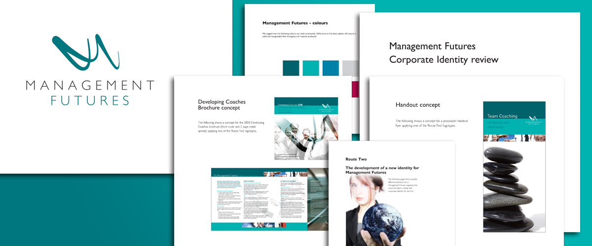
Management Futures
It was evident when we were asked to look at the re-designing of their annual brochure that what Management Futures really needed was a complete overhaul in the way they presented themselves to their market. The work involved a new logotype and branding guidelines covering the complete range of MF’s collateral.
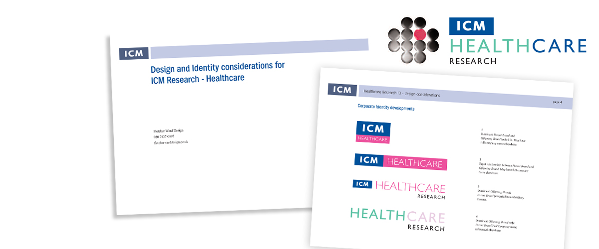
ICM Research
Another small company that expanded to become very successful extremely quickly and then needed a logotype and branding across the complete range
of items.
An immediately recognisable logotype.
ICM is now a Creston Insight company.
Babyboon
We’re not sure everybody’s child is this angelic but then
yours is - right?
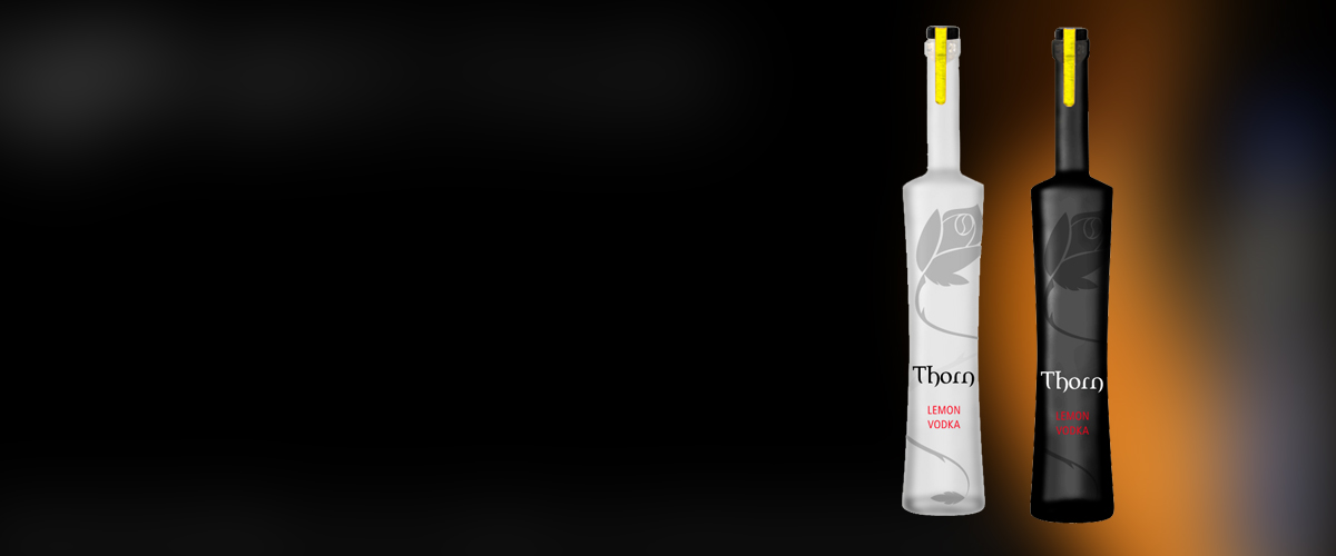
Thorn Grey
Another undercover logotype/branding exercise – this time with the packaging element added to the equation. This was for a South African drinks company who were testing the market for flavoured vodkas.
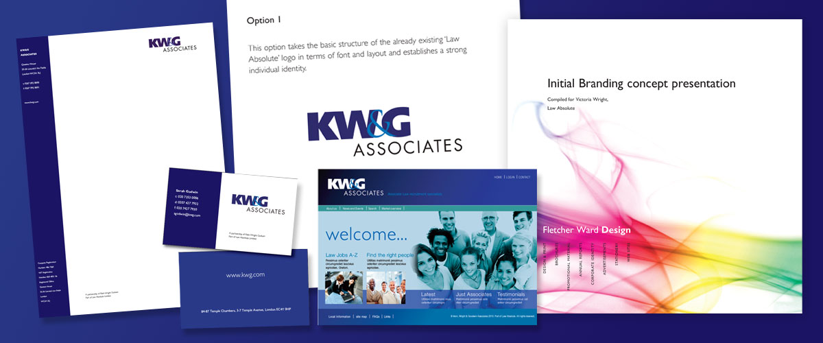
KW&G
A sister company for Law Absolute, KW&G was to be a recruiting company specialising in professional recruitment (rather than law sector recruitment) and we were asked to look at branding for the new company. Shown here is part of the presentation that took on elements of our original Law Absolute branding whilst creating a new strong identity in its own right.
Holiday Wardrobe
Part of the original logo and branding concept for an
e-commerce company selling holiday and leisure wear. Suits you.
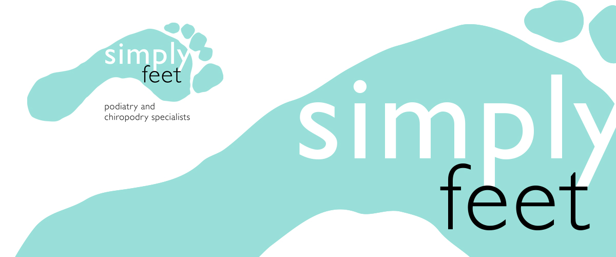
Simply Feet
We love this one. So simple. And it works.
Used on stationery items and retail outlet fascia.
BRANDING & IDENTITY. A well structured brand defines and establishes your company. It helps your message rise above the competition's. It adds value to your bottom line.